Visualizations designed to provide interesting analyses
The Analytics Platform provides several different visualizations, which make data more understandable and memorable for your audience. Each visualization is designed to present data in a specific way and facilitate analysis of the content.
Composition set
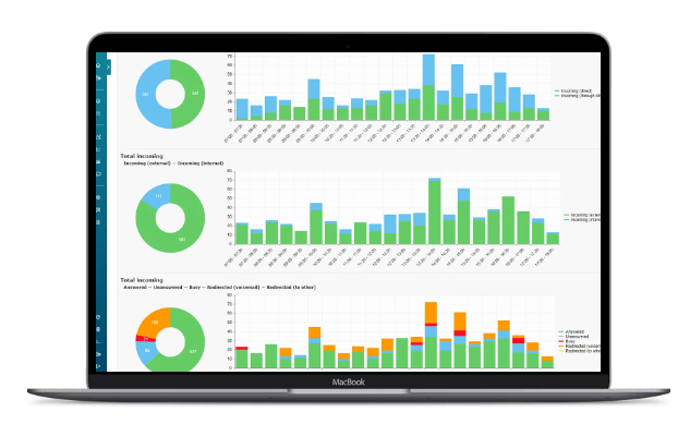
Reports often feature composite values, such as total incoming calls consisting of both external and internal data. The composition set visualization is designed to showcase these sets and their distribution within a composition for easy analysis.
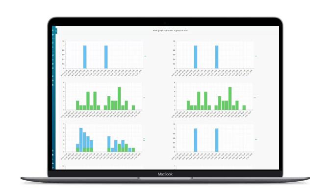
Heatmap
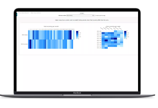
Identifies standout patterns or time periods, with each day represented by a coloured rectangle indicating values compared to the overall minimum and maximum. When the Result grouping is set to something other than Total, each measurement object or group is displayed as a row, allowing for easy comparisons over time and progress tracking.
Data distribution analyser
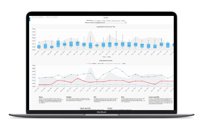
Evaluates the representativeness of average values in reports, with a box plot and line graph showcasing minimum, maximum, median, and quartile values. This visualization helps identify periods where average values do or do not accurately reflect actual values, providing valuable insights for analysis.
Column comparer
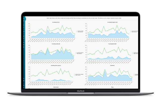
Generates area graphs for each column value, with the ability to set a reference column marked as a line in each graph. This visualization is useful for identifying correlations between values and understanding the reasons behind variations, such as determining if increased speed of answer was due to a higher volume of calls or longer call durations.
Top list
A simple way to list objects or groups based on selected column values, providing quick identification of high or low performing groups and facilitating easy comparisons between different objects or groups.

Dynamic columns
Dynamic column visualization is used to present data that varies depending on the report and column. The specific use case for this visualization will vary accordingly.
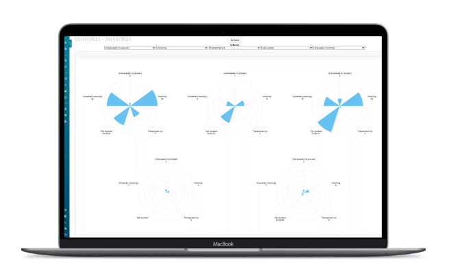
Radar chart
Allows for comparison of groups or objects across a set of values, with up to five different column values represented as a cone for each group or object.
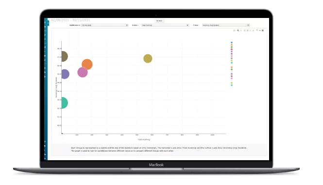
Bubble chart
The bubble chart visualization compares groups or objects across three different columns, with each group represented as a bubble where size is determined by one column value, and x- and y-axis are set to other column values. This visualization not only facilitates group comparisons but also identifies correlations between different columns.
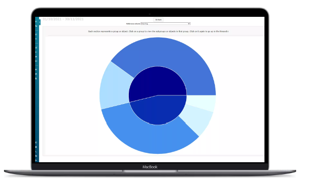
Sunburst
The sunburst visualization offers an overview of groups and objects and their significance in the organization, with the reference column set defining values used to draw each group's proportion or objects within a specific group. This visualization provides a quick and informative overview of communication in the organization.
Flow diagram
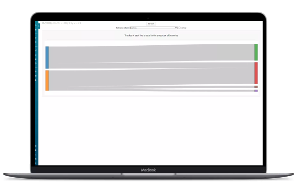
The flow diagram visualization showcases the flow of data in some reports, presenting the sequence of events in the system. This visualization is useful for understanding how a call or other process moves through different parts of the system, such as from a switch to an IVR and then to a queue before an agent answers.
Timeline
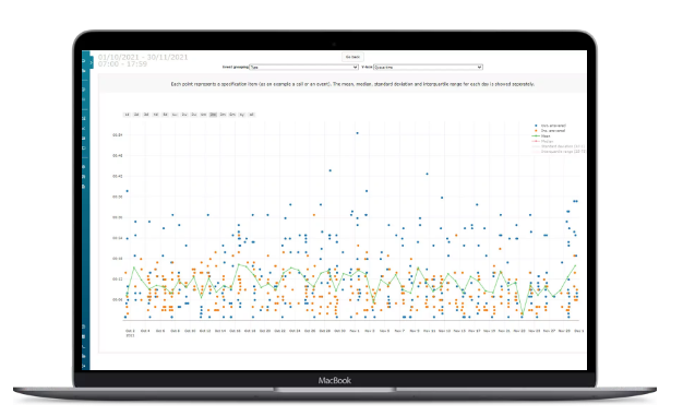
The timeline visualization plots each call or event based on its occurrence time, with the option to draw a line for the mean and other statistical measurements for each day. This visualization offers a graphical representation of the specifications for easy analysis.
Upgrade Your Customers Communications
From small local businesses to large international corporations, Dstny UCAAS provides the communication solutions they need to connect with customers and colleagues worldwide. And with truSip as your partner, you can be confident in delivering reliable and effective services to your clients.
Contact truSip today to learn more about how Dstny UCAAS can help your clients communicate better and grow their businesses.
